This is a contract-based project with UBYou, a company that supports college students in tracking their daily well-being and accessing campus and video resources through the UBYou app. I led a team of three to redesign the existing app with a focus on improving usability, UI, and accessibility for our target users, resulting in a 4.8/5 rating from five participants in the final usability testing.
My Roles
Team Lead
Product Designer
2D Vector Artist
Specifications
Duration:
Mar 24, 2025 - Apr 28, 2025
Tools:
Figma
Deliverables
High Fidelity Wireframes & Prototype
Design System
Usability Testings
A/B Testing
Affinity Mapping
Team
UX Researcher- Francesca Flores
UX Researcher - Monica Hurwitz
Client
UBYou company
Buisness Goals
Increase user acquisition and return rate
Enhance user growth and engagement
Product innovation with new features
Impact
Satisfaction Rate
96%
Increased from 16% — boosted overall satisfaction after testing.
Task Completion
100%
Increased from 64% — boosted completion rate after iterations.
A/B Testing
80%
Most users prefer our design over the previous design.
Challenges
Enhance usability and intuitiveness of the app.
Redesigning key screens and red routes.
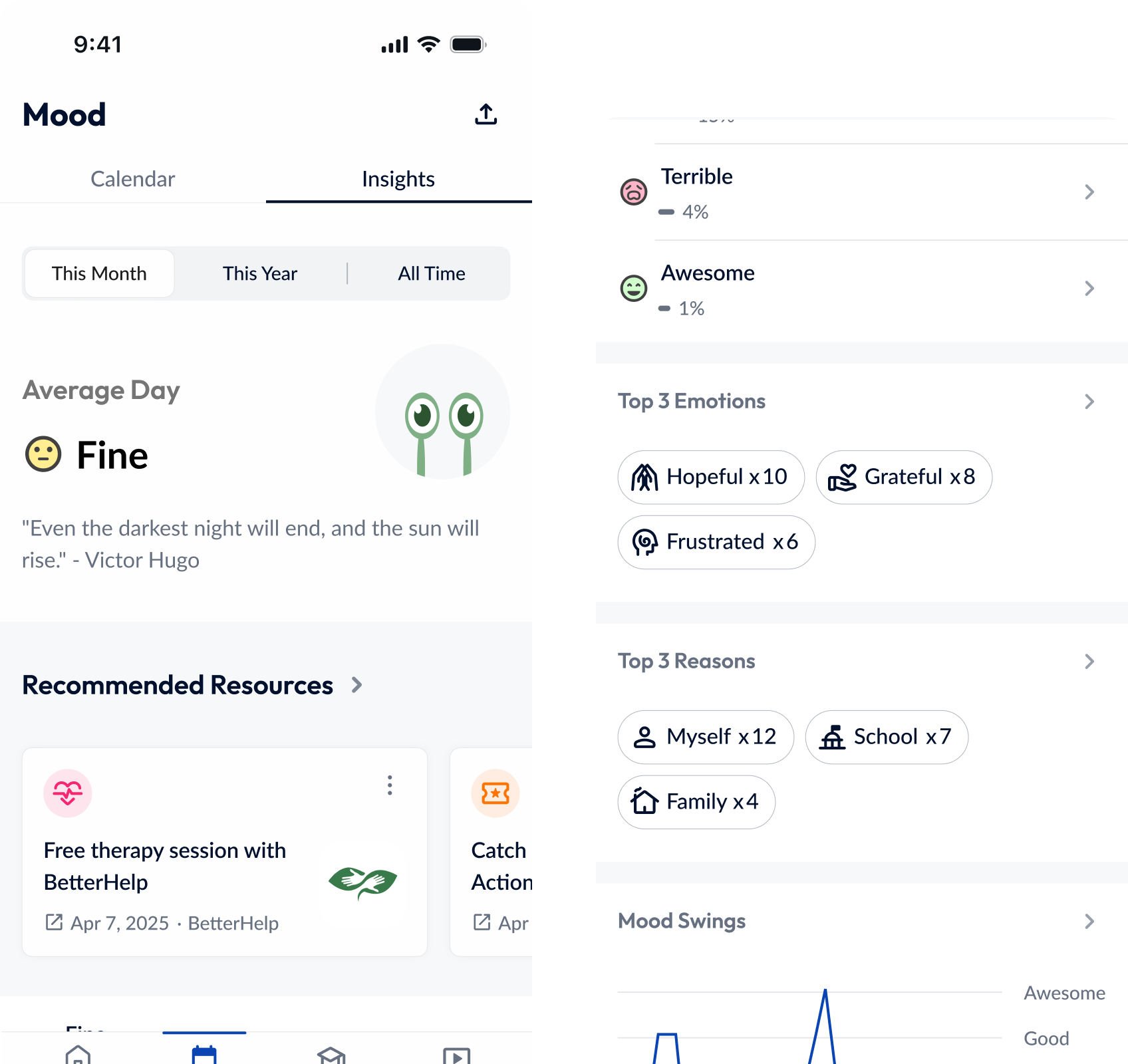
Improve effectiveness with mood tracking, categorization, and data visualization.
Improve user interface for a friendly, modern look.
College students struggle to improve their mental health and have difficulty accessing campus resources.
Solution
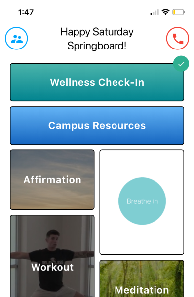
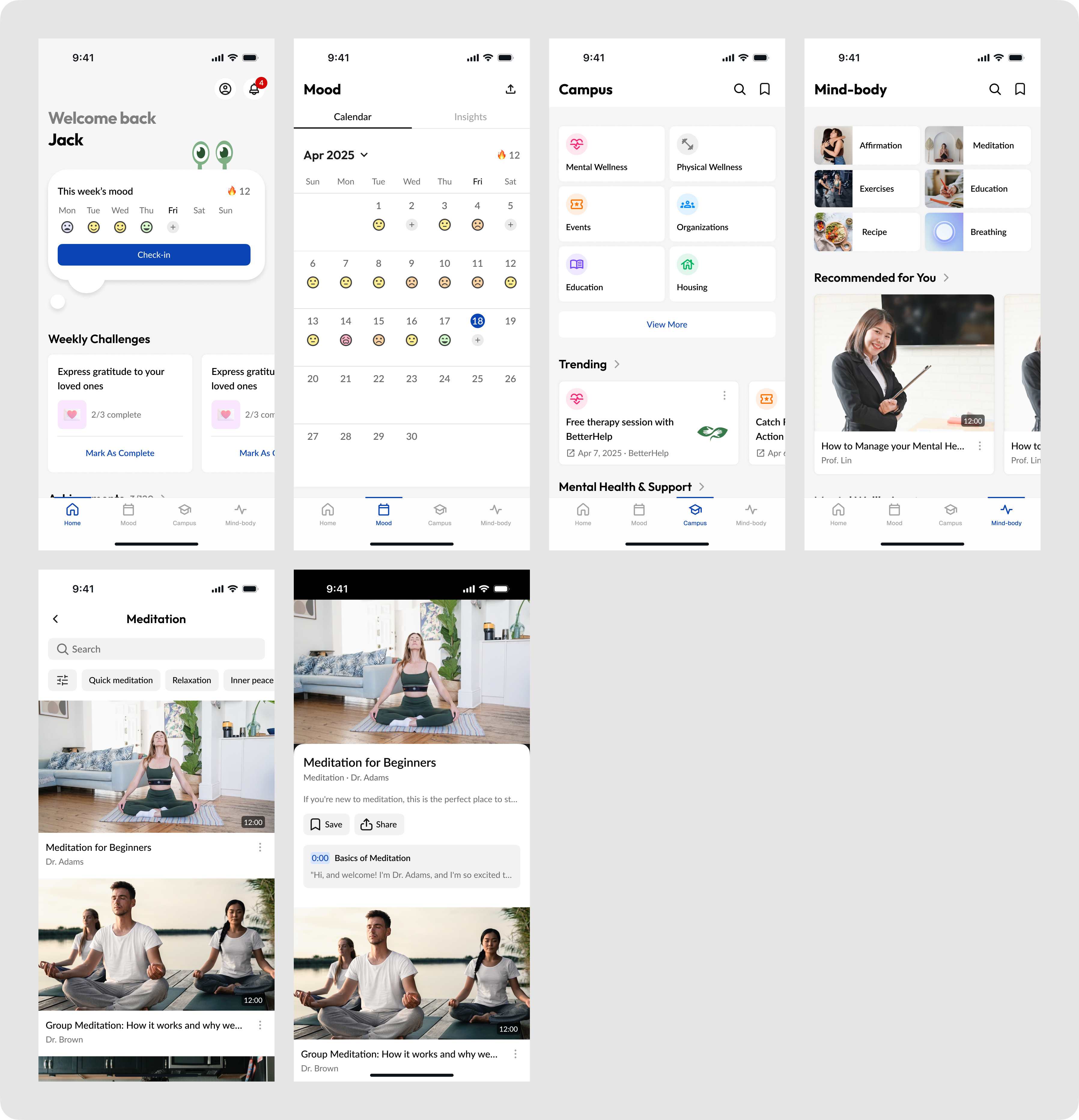
After two rounds of usability tests and multiple iterations based on feedback and test results, here are the key features of the final design.
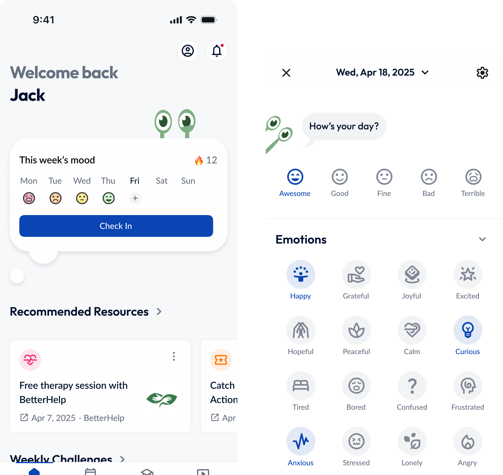
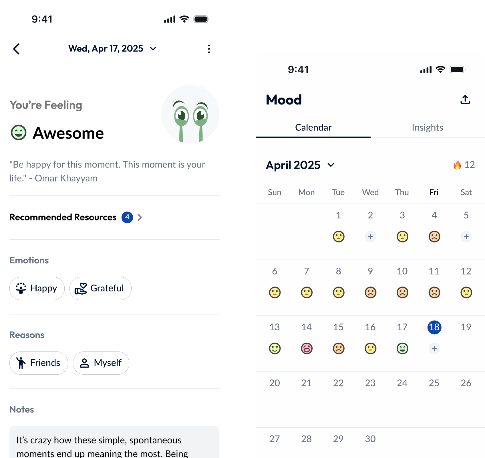
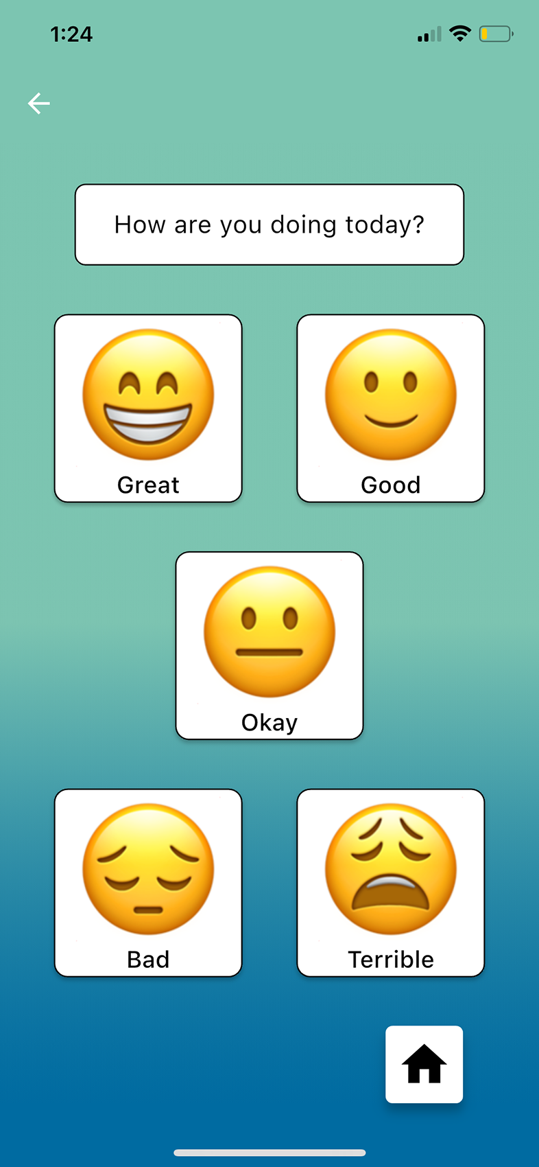
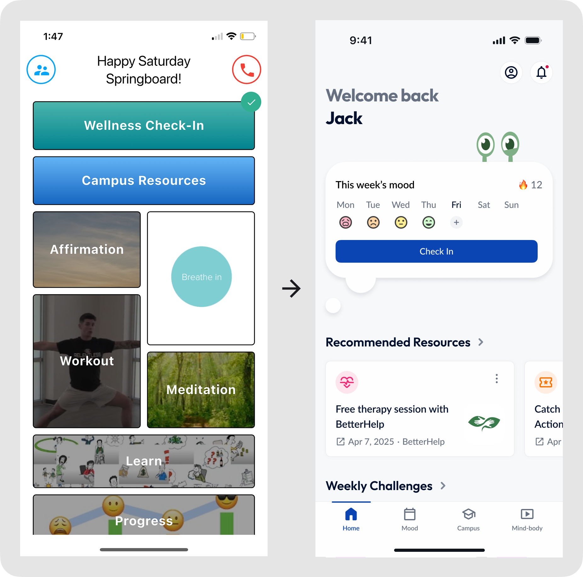
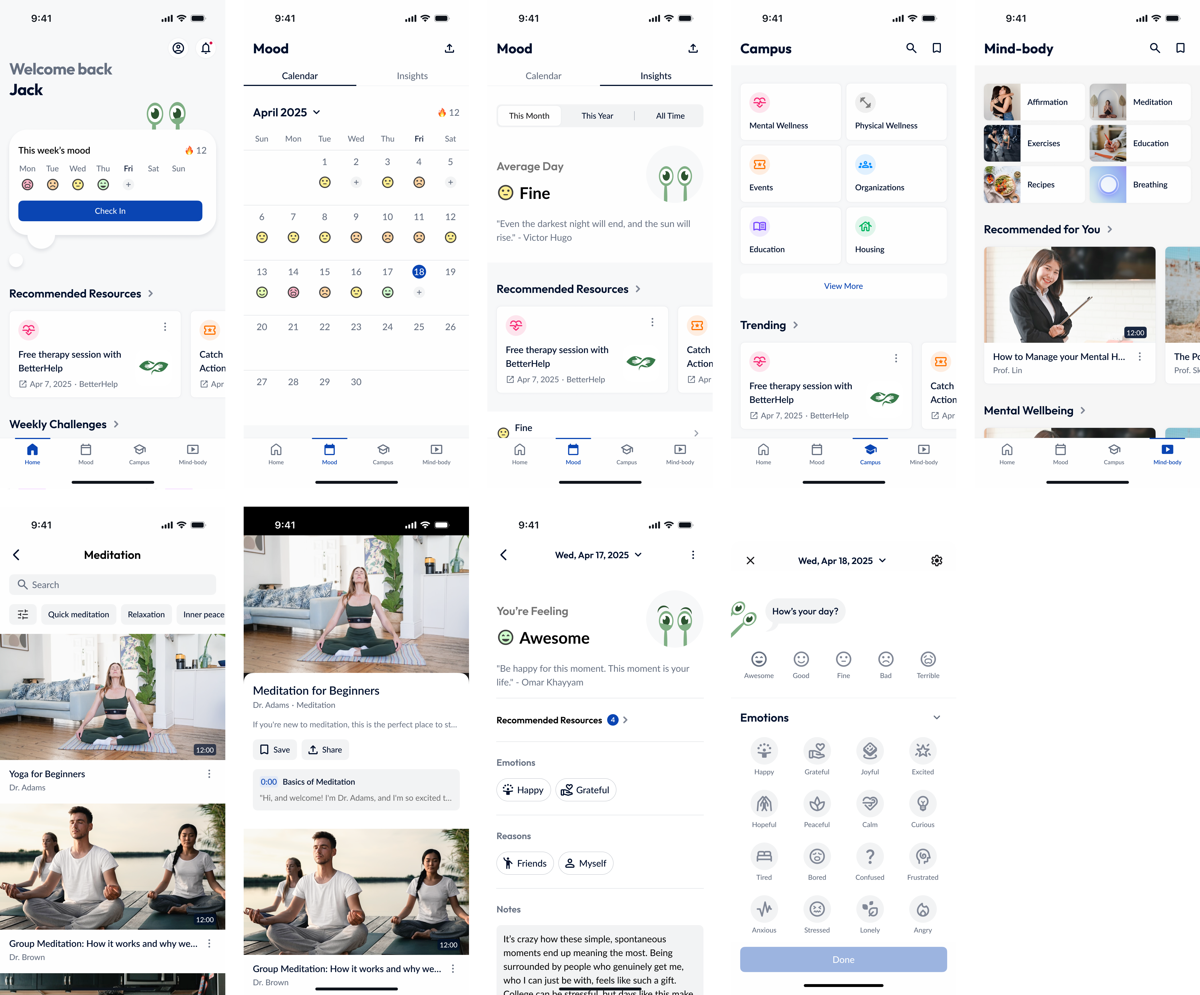
Track Your mood.
Track your mood accurately with ease.
View Journals.
Capture moments & feelings with Journals.
Better Yourself.
Better yourself with insights and recommended resources.
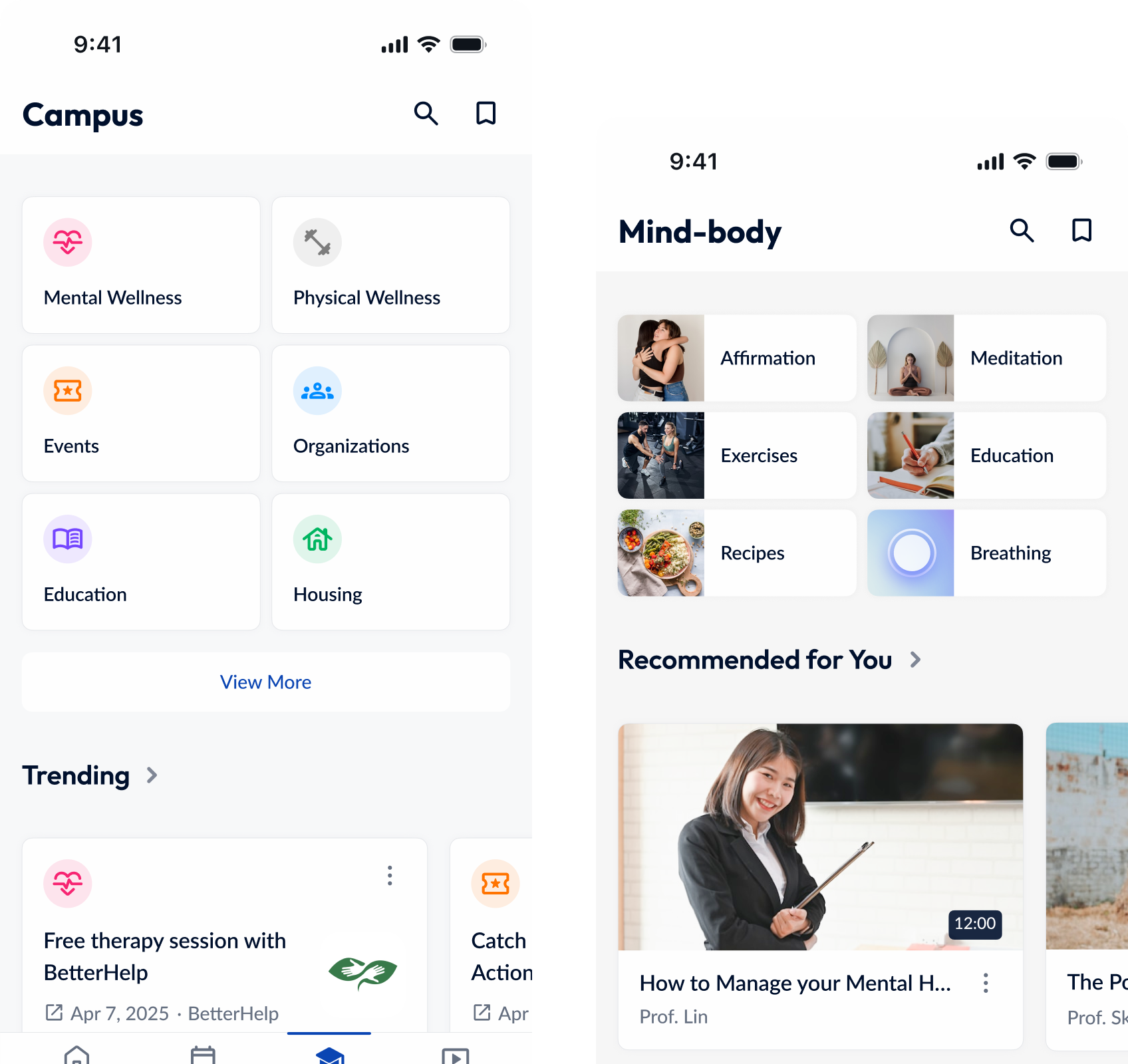
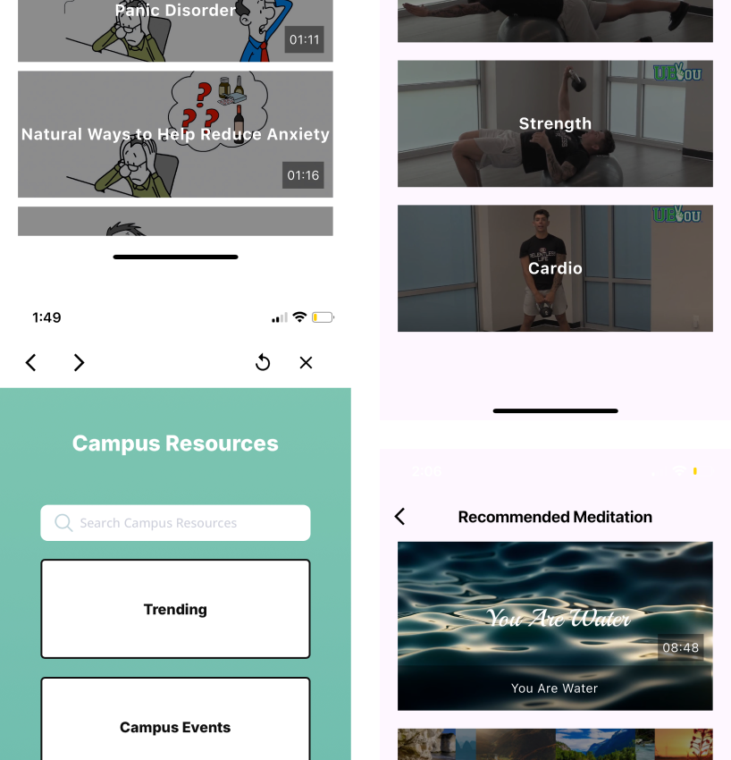
Accessible Resources.
Find campus / video resources instantly.
Understanding the Product & Identifying Challenges
After meeting with stakeholders and going through secondary research, heuristic analysis, personas,user stories, designs and more from the previous team, here are the areas that need improvement:
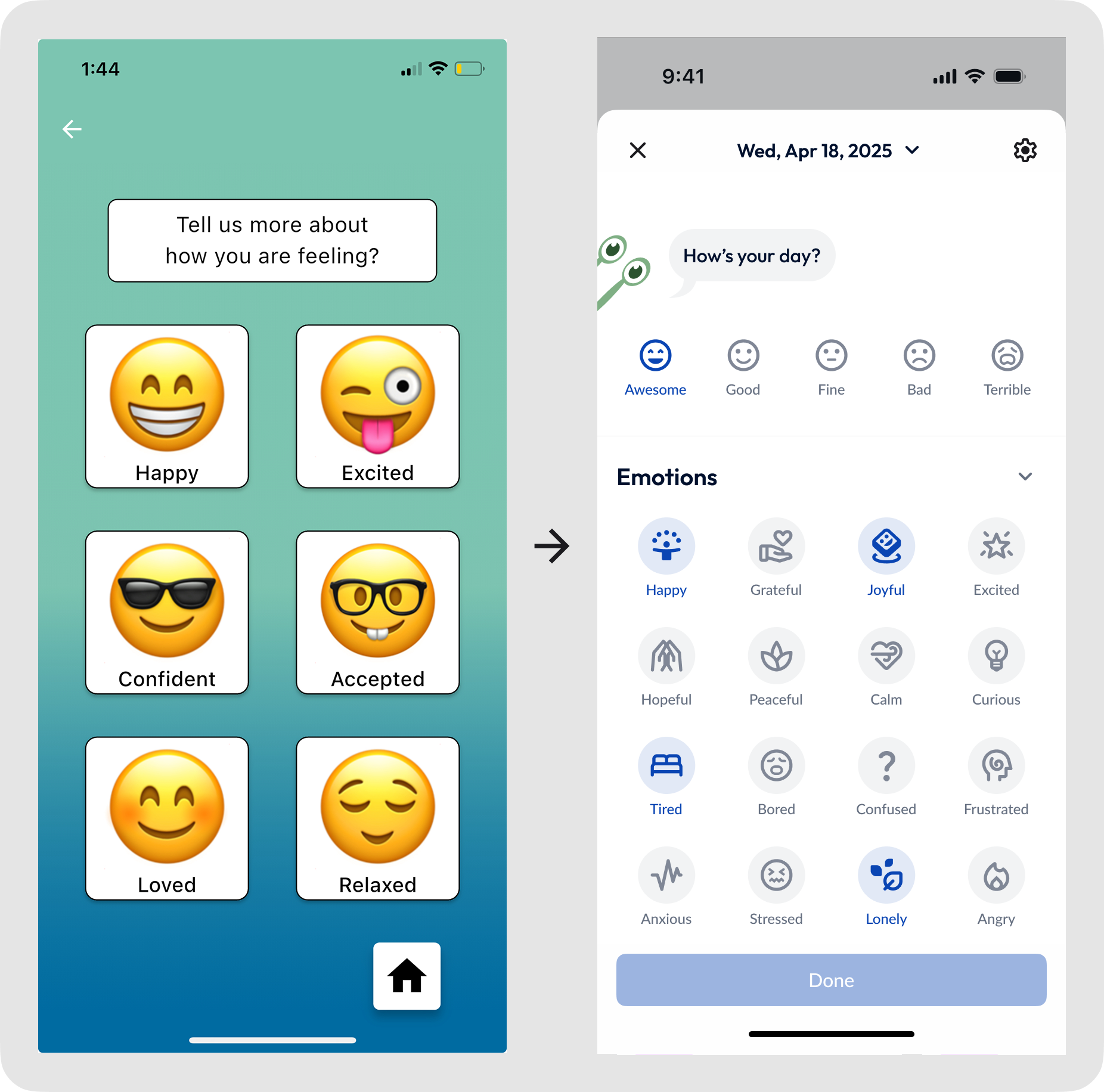
1. The app can be more versatile with mood tracking
The mood tracking feature is limited in offering options that truly reflect the user’s feelings.
Proposed Solution 🛠️
A mood tracking flow that allows users to select multiple emotions and reasons, as well as offering text and image inputs to increase versatility.
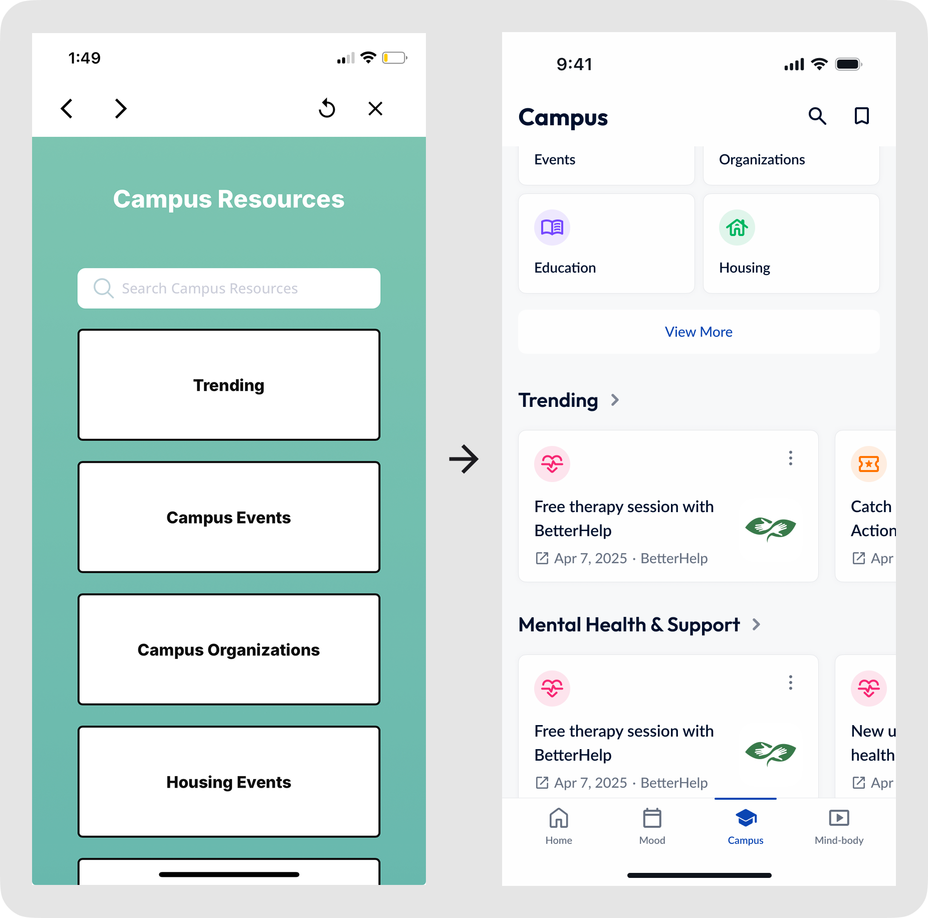
2. Resources can be more intuitive and easier to find
Resources can be difficult to find when presented as lists without preview options.
Proposed Solution 🛠️
Design screens that separate categorized campus and video resources, incorporating carousels for previewing resources.
3. The app can be more engaging with a modernized look
The app feels less like a mental health app due to the UI choices with no gamification.
Proposed Solution 🛠️
Introduce a mascot that reflects the user’s mood, along with weekly challenges to encourage app usage.
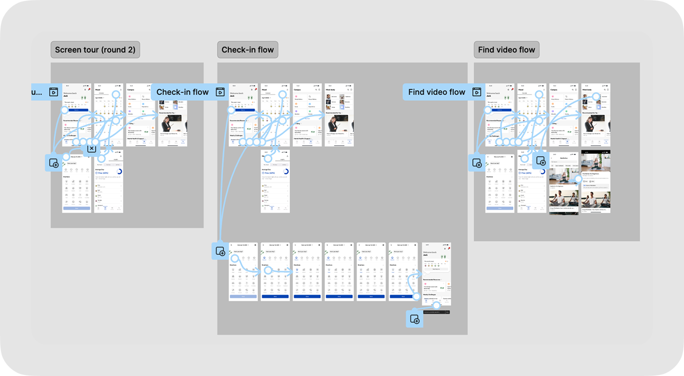
Creating a Testable Prototype Within Four days
I completed a design sprint with a clear focus on business goals, target users, MVPs, and key challenges, and created a testable hi-fidelity prototype within four days due to time constraints. Here are the things that we tested:
Screen tour.v1: Understanding users' overall impression of the design and identifying areas for improvement.
Find video flow.v1: Assessing the usability of a core feature within the app.
A/B testing.v1: Comparing the existing design with our proposed design to evaluate improvements.
A/B Testing
To validate significant visual and design updates, we conducted A/B testings with five users to compare existing design with our proposed design. Here's what we found:
1/5
user prefers the existing design.
4/5 🎉
users prefers the new design.
Findings
All users find the new design more intuitive and visually appealing. (5/5)
All users think the new design's UI is better suited for a mental health app. (5/5)
All users find the new design more engaging, encouraging, and fun to use. (5/5)
One user thinks the existing design's colors align better with the brand . (1/5)
Building a Design System
After recieving approval from stakeholders, I built a comprehensive design system that prioritizes accessibility and meets industry standards.
Usability Testing (Round 1)
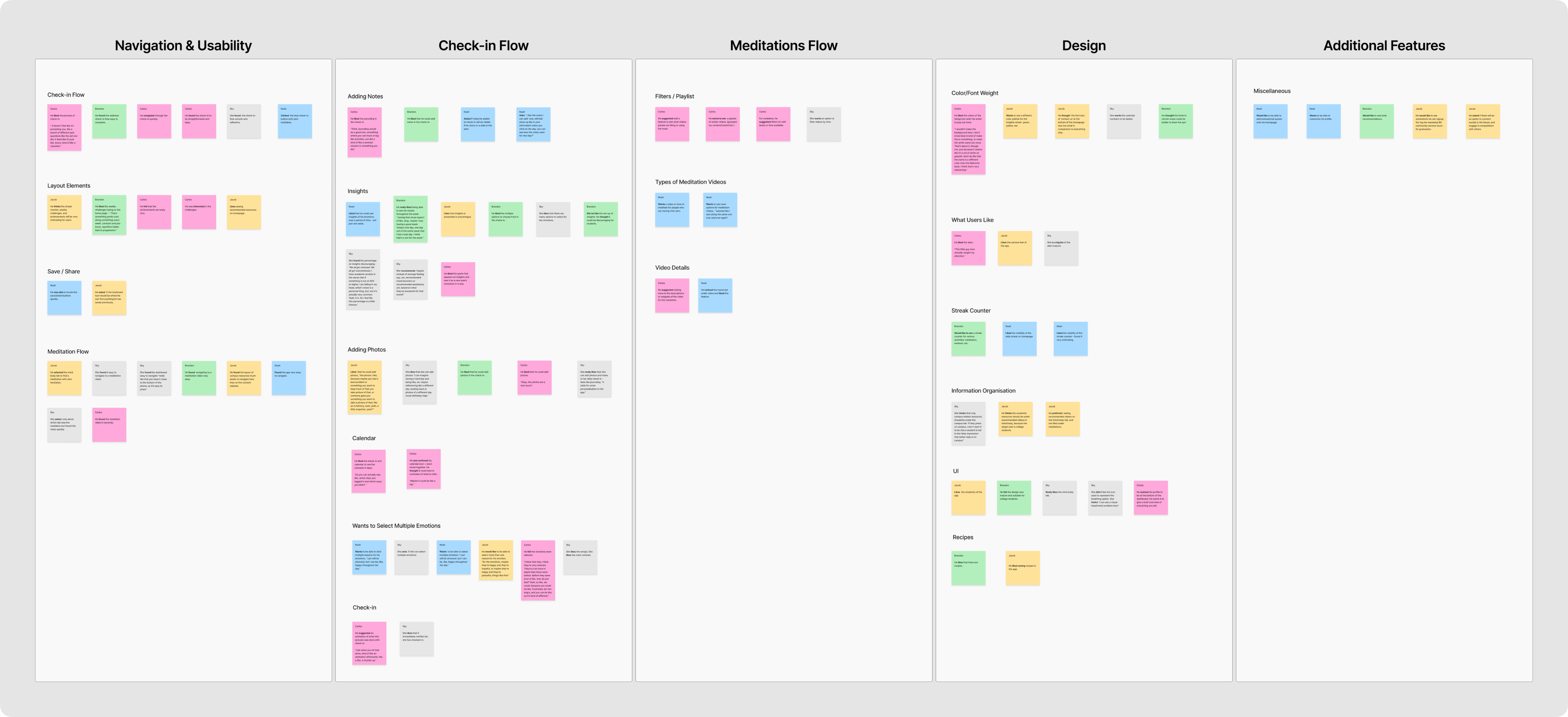
We conducted five one-on-one testings with college students. After synthesizing the data through affinity mapping and logging errors in a usability test report, here's what we found:
Users appreciate the app’s intuitive design and find it easy to use.
Users find the app visually appealing and feel it convey the theme of a health-focused app.
Users enjoy the mascot, feeling it add a fun and engaging element to the app.
Users appreciate the weekly challenges, finding them motivating and encouraging.
Iterating based on user Feedback and stakeholders
After creating the design system, I iterated on the designs based on feedback from both users and stakeholders. Here are the updates:
Applied design system to ensure consistency and efficiency.
Introduced mood tracking flow.
Created screens for campus resources and developed data visualizations and recommendations for mood insights.
Designed data visualizations and recommendations for mood insights.
Usability Testing (Round 2)
We did conducted another round of one-on one-testings with college students. After synthesizing data through affinity mapping and logging errors in the usability test report, here's what we found: