House2Home Website

Home Decorating with Ease
UI/UX
Product Design
Research
Testing

Overview

This is a modified version of the Google Venture design sprint with Springboard and BiteSize UX. I was given five days to create a solution for an prompted e-commerce website (House2Home) that sells decorative items for living spaces. 
My Roles
  • Solo UI/UX Designer
  • Solo Product Designer
Specifications
Duration:
  • December 10-15, 2024
Tools:
  • Figma
Deliverables
  • Mapping end to end expereince
  • Personas
  • Sketching
  • Lighting Demo
  • Crazy 8s
  • Storyboarding
  • High Fidelity Wireframes & Prototype
  • Usability Testings
Problem
  • Many people struggle to decorate their living spaces to achieve the desired look.
  • People who have recently moved often struggle to stay within their budget for home decorations.
Solution
A website that: 
  • Offers budget-friendly kits in various styles and affordable price ranges.
Home decorating can be challenging for those without a design background and on a budget.

Day 1: Mapping

To understand the problem space, I took notes on the one-on-one user interview, research highlights, and persona given by BiteSize UX. Here are the common frustrations and goals that I found: 
Frustrations
  • People struggle to achieve the desired look for their living spaces with decorative pieces.
  • Buying multiple decorative items can quickly become expensive and unaffordable.
  • Purchased items sometimes turn out to be too large for their living spaces.
  • Finding decorative pieces that work well together can be a challenge.
Goals
  • Most people want a quick "facelift" for their apartment without the hassle of shopping for numerous individual items.
  • Most people aim to find affordable decorative pieces that will give their living spaces the look and feel they desire.
Creating a modified persona 
After synthesizing the given data, I found that the given persona was too simplified and fell short of representing the research highlights. Therefore, I created a modified persona with additional sections for biography, personality traits, and a given quote that resonates with the target users.
Mapping end-to-end experiences
To help users achieve the looks of their living spaces, I mapped out 3 potential solutions:
  • Finding products based on overall style
    People who just moved  > Select ideal style > Select ideal products > Add to cart > Checkout
  • Finding products based on the user’s living space
    People who just moved > Scan / upload living space digitally > View items in the VR space > Select ideal products > Add to cart > Checkout
  • Find items based on budget
    .People who just moved  > View items that fit the budget > Select ideal products > Add to cart > Checkout
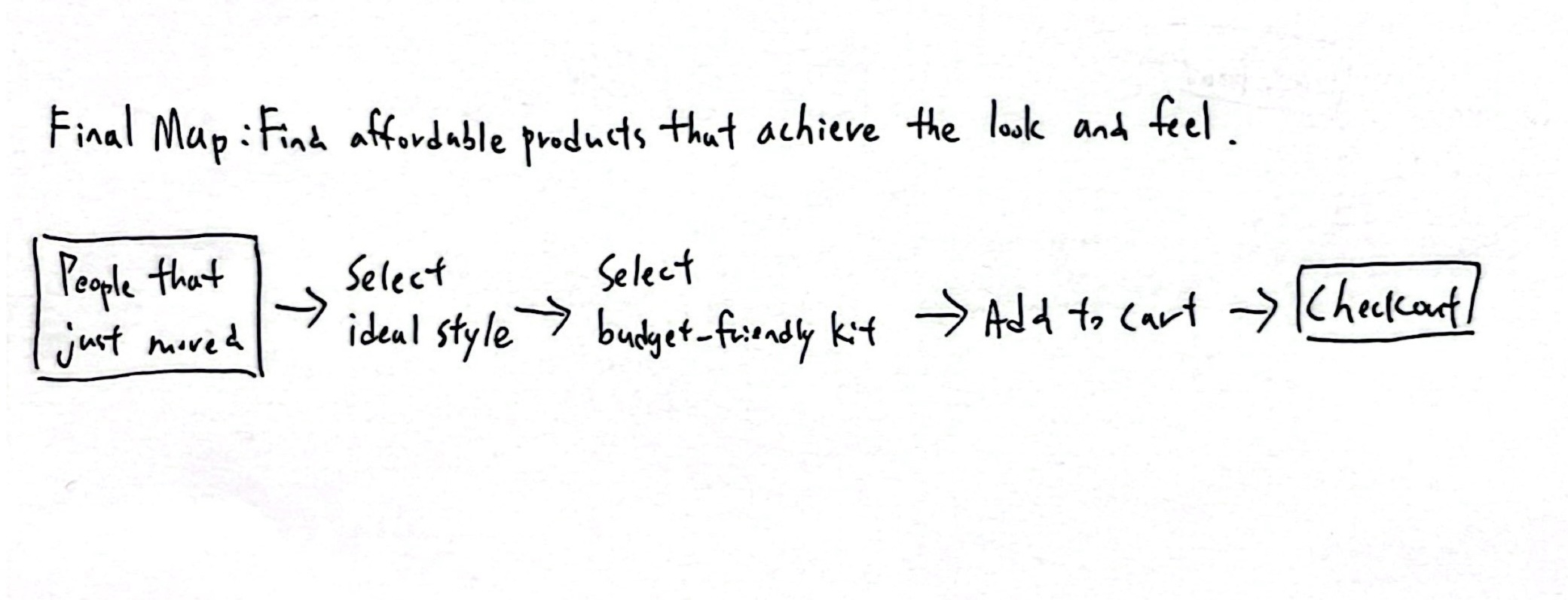
Final Map
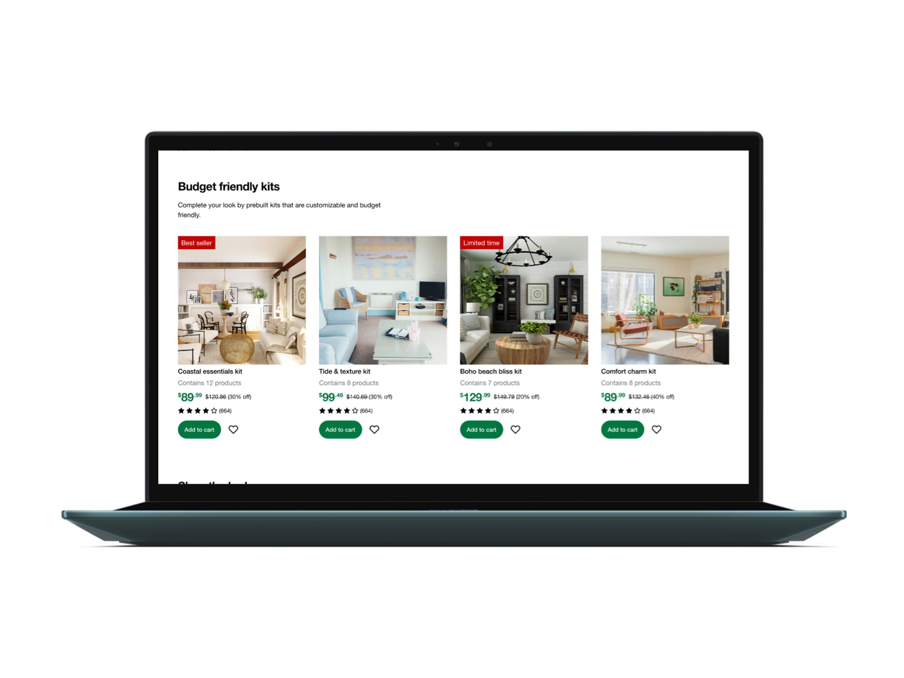
After evaluating the 3 solutions, I decided to merge map 1 and map 3 to create the final solution, which helps users effortlessly achieve their desired look at an affordable price — budget-friendly kits curated by interior designers. Here is the flow of my final map:
    • Finding affordable products that achieve the look and feel
      People that just moved > select ideal style > select budget-friendly kit > Add to cart > Checkout 

    Day 2: Sketching

    To gain a deeper understanding and gather inspiration from how real-world products tackle similar challenges, I conducted a lighting demo to analyze Pinterest, IKEA, and Amazon. Here are the features I would be applying to my design: 
    • Providing different styling examples to inspire users
    • Recommends users with related items in style.
    • Filter bar that helps users to narrow down and find what they want.
    • Enable users to view individual product details by hovering over product image.
    Sketching critical screen variations with crazy 8s
    Based on the insights I gained from the lighting demo, I sketched critical screens featuring budget-friendly kits and related products that follow the same aesthetic with crazy 8s.
    Final critical screen
    I decided to go with the selected critical screen below based on these reasons:
    • Hero image with text introducing the style
      Provides users with an opportunity to learn more and immerse themselves in the style.
    • Product detail overlays when hovering over the image
      Enables users to shop effortlessly and view specific items they're interested in directly from the image.
    • Categorized carousels
      Helps users easily browse through budget-friendly kits and recommended items that align with their chosen style.
    Creating a solution sketch
    After finalizing my critical screen, I sketched the screens before and after to demonstrate how my solution would function in a real-life scenario.
      • Finding affordable products that achieve the look and feel
        People that just moved > select ideal style > select budget-friendly kit > Add to cart > Checkout 

      Day 3: Deciding

      By offering budget-friendly kits, users can easily shop for the looks they desire. Below is a storyboard that illustrates how users would search for a kit based on their specific needs (style, affordability).

      Day 4: Prototyping

      I spent a day creating a high-fidelity prototype that includes the style page (critical screen), as well as the screens before it (shop by style page) and after it (product page).

      Day 5: Testing

      To validate my solution, I conducted 1 round of usability testing with 5 target users. Here's what I found:
      • Users had no issues navigating and completing the given tasks.
      • Both flows were found to be intuitive.
      • The UI was praised for being clean and modern.
      • Users appreciated the concept of purchasing budget-friendly kits.
      • The ability to shop by style and room was well-received.
      Encountered issues & Proposed Solutions
      Due to time constraints, I wasn't able to iterate and test my designs. Here are the encountered issues and proposed solutions:

      Takeaways  📖

      If I have more time ⏳

      More Projects

      Like What You See? Contact

      darrenyang.design@gmail.com