SpendWise App

Advanced Subscription Tracking & Management
UI/UX
Product Design
Research
Testing

Overview

This bootcamp project aims to create an app for a prompted digital company that offers subscription tracking services to its users.
My Roles
  • Solo UI/UX Designer
  • Solo Product Designer
  • Solo UX Researcher
Specifications
Duration:
  • December 23, 2024 -March 8, 2025
Tools:
  • Figma
Deliverables
  • Secondary Research & Screener Survey
  • One-on-one Interviews
  • Affinity Mapping & Empathy Mapping
  • Personas
  • JTBD & HWM Statements & User Stories
  • Heuristic Analysis
  • User Flows & Site Map
  • Low Fidelity Wireframes & Prototype
  • High Fidelity Wireframes & Prototype
  • Usability Testings
Problem
  • People tend to overspend and struggle to keep track of their subscriptions.
  • People struggle to track all of their subscriptions with multiple linked bank accounts .
  • People frequently forgot to cancel free trials & subscriptions they no longer use.
Solution
An app that: 
  • Tracks all subscriptions in one place.
  • Cancels subscriptions with ease.
  • Provides analytics to make better financial decisions.
  • Has an integrated AI assistant that give suggestions and answers questions.
Subscriptions drain your wallet without you realizing.

Research

From secondary research, studies have found that:
  • Participants typically spend 250% more than their estimated monthly spending on subscriptions.
  • 74% of participants say it is easy to forget about subscriptions.
  • 42% of participants say they have forgotten about an active subscription(s) they no longer use.
  • 76% of the sites and apps examined have at least one possible dark pattern, and nearly 67% have multiple dark patterns.
Primary Research
To better understand the problem space, I recruited 5 participants through screener surveys for one-on-one interviews. Here's what I found:
Attributes
Interview findings

Affinity Mapping

To synthesize data from interviews , I started with affinity mapping, breaking 70 data points into 3 main themes: Uncertainty, Tracking, and Reminders.

Empathy mapping

With Empathy mapping, I was able to identify the two target personas :
  • Young adults who have multiple subscriptions.
  • Working professionals who owns multiple credit cards 

Personas

By creating Personas, I have identified the needs, experiences, behaviors, goals, and pain points of the target users.

JTBD & HWM Statements & User Stories

I listed out the jobs, needs, and circumstances of the target users using the JTBD framework, came out with 4 HWM Statements, and created User Stories to focus on the MVPs. Here are the 5 HWM Statements: 
1. How might we help people track subscriptions before getting unwanted charges?
People forget about subscriptions due to different linked bank accounts / platforms and hidden reminders, resulting in paying subscriptions they don’t need.
Proposed Solution 🛠️
An app that shows subscriptions, upcoming payments, and transactions all in one place.
2. How might we remind people to cancel unwanted subscriptions on time?
People often realized they had unwanted subscriptions after getting charged. 
Proposed Solution 🛠️
An app that reminds and shows users upcoming payments.
3. How might we help people cancel subscriptions effortlessly to feel safe and secure?
People get frustrated when companies make subscriptions hard to cancel with dark patterns.
Proposed Solution 🛠️
An app that allows user to cancel directly through the app and shows alternative ways to cancel the subscription.
4. How might we introduce people to better subscription plans/options to utilize their spending? 
Proposed Solution 🛠️
An app with integrated AI to provide actionable recommendations and feedback.

User Flows & Site Map

After doing heuristic analysis on industry leaders such as Rocket Money, TrackMySubs, and One Main Trim, I brainstormed an app solution for tracking subscriptions. Here are the key user flows and site map of the app solution:

Wireframes & Prototyping

After rapid sketching to ideate app screens, I transformed my sketches into low-fidelity wireframes and prototyped them to test with users.

Design System

Here is a simplified design system that I have built.

Hi-fidelity Design

After 2 rounds of usability tests and numerous iterations based on test results and feedback, here are the final hi-fidelity wireframes:
Subscriptions All In One Place.
Connect your bank accounts and track all your subscriptions in one place.
Upcoming Payments & More.
View upcoming subscriptions and catergorized subscriptions with ease.
Cancel Subscriptions Instantly.
Cancel subscriptions with SpendWise or by yourself within a few steps.
Real Time Analytics.
Understand where your money goes  to make better finanical descisions.
Integrated AI Assistant.
Understand your spendings to make better finanical descisions.

Key Challenges

Here are the top 3 challenges that I encountered from the 2 rounds of usability tests on red routes with 10 participants in total: 
1. Users get confused by the mix of spent and upcoming spendings in Analytics. 
Users aren’t expecting to see spent and upcoming spendings coexisiting in Analytics, making data harder to interpret.
Final Solution ✅
  • Catergorize spent and upcoming spendings into sections.
  •  Remove "Yearly Spending" from the Dashboard and introduce "This Month’s Spending" along with statistics for "Spent" and "Upcoming" spending.
2. Users thinks the AI assistant should be easily accessible but not overly emphasized.
Users are having mixed preferences with the prominency of AI section on the Dashboard.
Final Solution ✅
  • Introduce AI Chat bot tab.
  • Remove the AI section from the Dashboard.
3. Users want to gain deeper insights into their subscriptions
Users want to gain deeper insights into recent price changes, apps they don’t use frequently, and more visual graphs for better analysis.
Final Solution ✅
  • Add indicators for price changes compared to the previous month.
  • Introduce  “Most Active Applications” section in Analytics. 
  • Introduce line graphs for data visualization.

Design validation

The design was validated through two rounds of usability testing and did not encounter errors during the final round. Here are the findings :
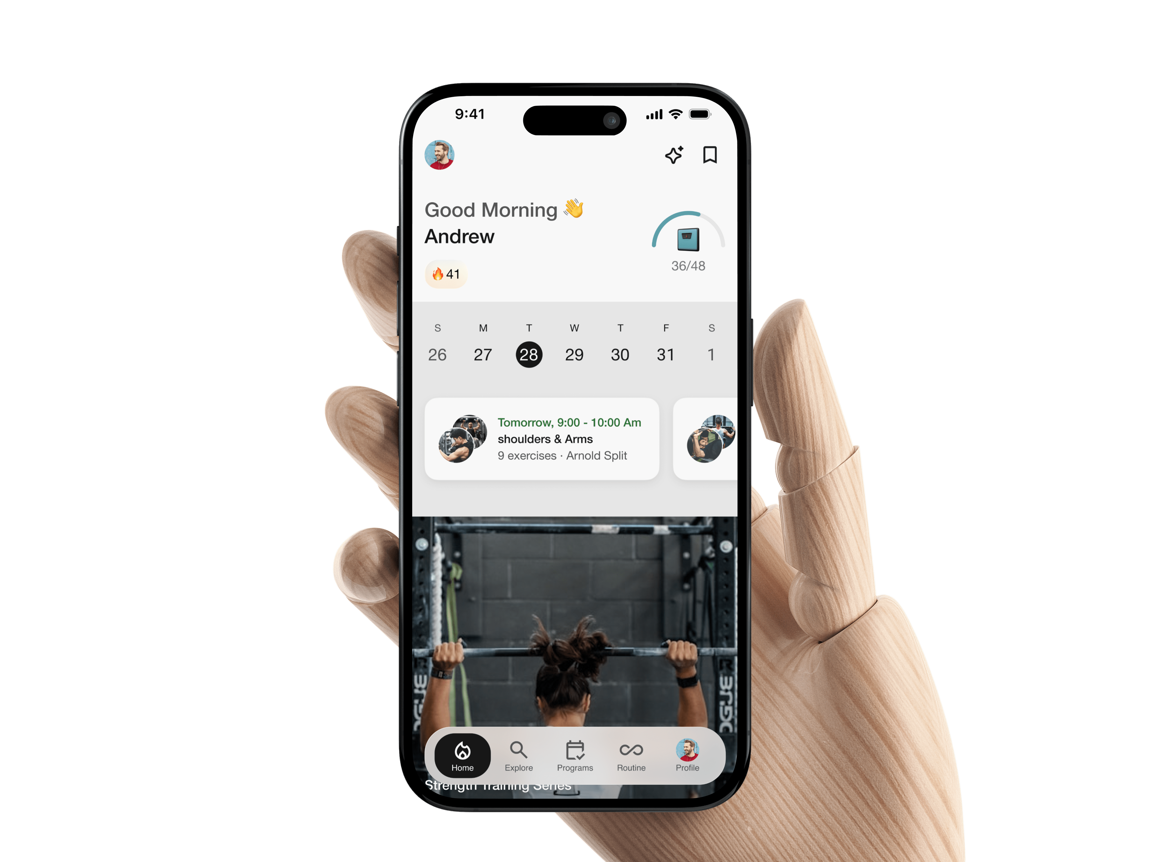
1. The design and navigation are intuitive
Users appreciate the app's intuitive design, user-friendly navigation, and appealing features and visuals.
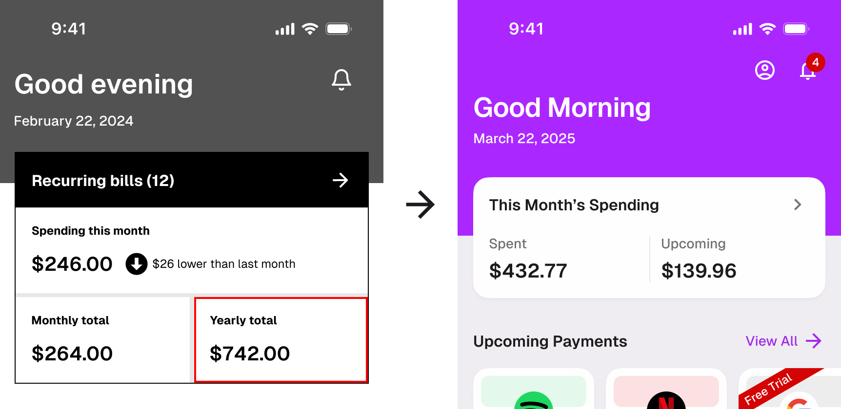
2. Analytics and insights help making better decisions
Users find the analytics and insights about their subscriptions to be helpful.
3. Canceling subscription with ease
Users find it convenient to cancel subscriptions directly through the app with alternative ways provided.
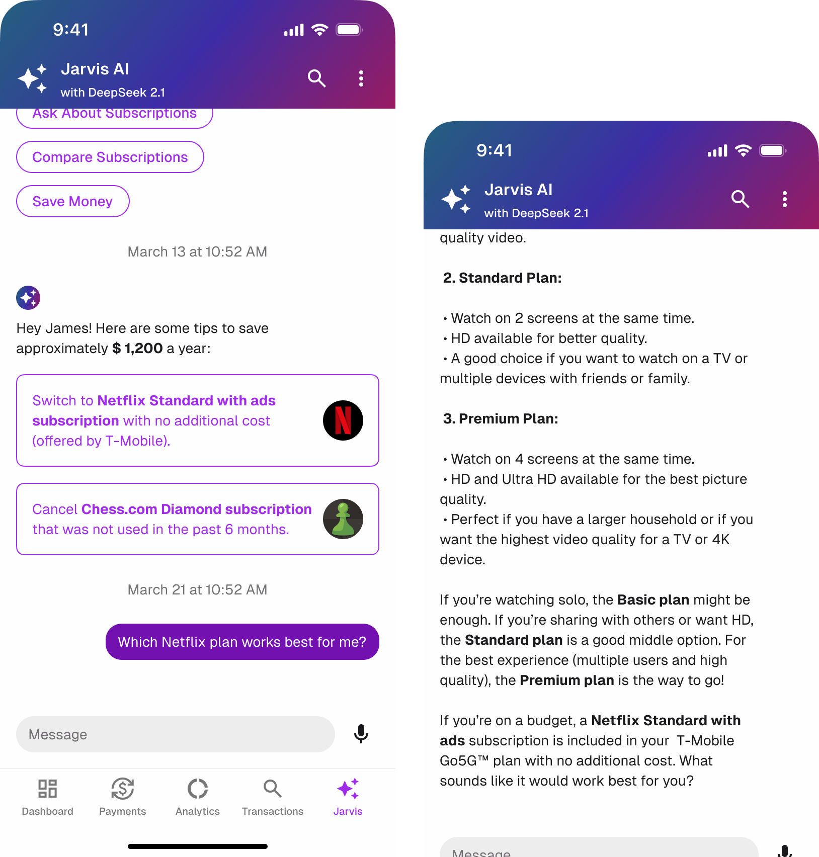
4. Al chatbot for personalized recommendations
Users value the personalized recommendations provided by the app's integrated AI.
5. Custom payments for optional tracking
Users like the flexibility to add custom payments for subscriptions and free trials that aren’t connected to their bank accounts.

Final Design

After final iterations, here is the final design:

Takeaways  📖

1. Naming components differently for versions to avoid unwanted changes.
I duplicated the components into a new file to manually detach and recreate them for newer versions, which slowed down my productivity.
2. Project plans improves efficiency
I spent a day creating project plans for the upcoming months to increase time efficiency and hold myself accountable.
3. Weekly meetings with a mentor is a must
Meeting with a UI/UX mentor weekly has been extremely valuable, allowing me to grow and refine my skills while validating small design decisions before conducting usability tests.

If I have more time ⏳

More Projects

Like What You See? Contact

darrenyang.design@gmail.com